With the introduction to Android 12, Google has been working mighty to adapt all of its apps with the Material You theme. So far, numerous apps including Gboard, Contacts, Camera, Chrome, and more have managed to sync with the new design. Once again, Chrome for Android is getting tested with a new UI for downloads and bookmark section.

Must see: Download latest wallpapers by Google Chrome OS here
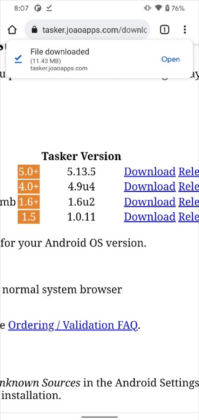
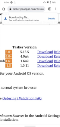
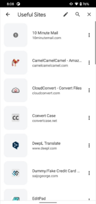
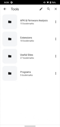
The latest design of Google Chrome for Android gives the downloads section a more modern and refreshed look. Unlike before, the new layout shows the current downloads as a toast at the top of the screen. Moreover, the entire download folder can also be spotted there in a round-shaped card offering an “Open” button. Alongside, the bookmarks panel is also redesigned and updated. The new layout features a larger squircle icon with more spacing between the items.
The refreshed UI update can be enabled via chrome://flags via flipping under the “show download progress message” flag. Although, the layout of the download page is enabled by default for several users running the recent Canary builds of Chrome. However, this is not the case with the bookmarks section. The UI for the page has to be toggled under the “enables the visual refresh for bookmarks” flag.
As of now, the new designs are limited to Chrome Canary releases. Also, we can’t commit if it will make a way in a stable phase yet. Thus we have no other option but wait to see if Google will adopt the fresh theme.


